Author Archives: hcdatelier

A TASTE OF SPAIN: 3 BARCELONA RESTAURANTS BY EL EQUIPO CREATIVO

thumbs_30662-counter-la-dolca-el-equipo-creativo-0615.jpg.1064x0_q90_crop_sharpen

Project: La Dolça. Cuisine: Dessert. Square Feet: 1,100. Photography by Adrià Goula.

Matthew Powell | June 24, 2015

Fresh picks from Barcelona show off El Equipo Creativo’s flair for food:
1. La Dolça
Cuisine: Dessert.
Square feet: 1,100.
Standout: With tabletops like oversize doilies and giant fiberglass fruit hanging overhead, this might be the café version of Alice’s Adventures in Wonderland.

interiordesign.net

FUNKY CHICKEN: KENGO KUMA REIMAGINES TETCHAN RESTAURANT

thumbs_91438-interior-tetchan-yakitori-restaurant-kengo-kuma-associates-0615.jpg.1064x0_q90_crop_sharpen

LEDs illuminate the central counter. Photography by Jimmy Cohrssen.

Winifred Bird | June 24, 2015

When you head one of Japan’s most illustrious architecture firms, respon­sible for award-winning museums and mixed-use towers, it’s unusual to be commissioned for a hole-in-the-wall yakitori joint, as in chicken skewers—designed by an unknown architect in an unknown year. But that was precisely the scenario for Kengo Kuma & Associates, asked to reimagine Tetchan. Kengo Kuma accepted only because the owner was a longtime fan.
The restaurant sits in a maze of Tokyo alleys where, in the postwar years, black-market vendors hawked their wares and, these days, salarymen gather for afterwork beers. Inside the two-level, 325-square-foot space, the rooms were cramped, the ceilings low, and the columns irregularly placed. Those limitations, however, became Kuma’s inspiration, he says: “I used the negative conditions to evoke the black-market character.”
Leaving the timeworn concrete floor and the spiral staircase untouched, he introduced two unconventional materials: discarded Ethernet cables and acrylic from melted-down speedometer covers, all scrounged from a waste-disposal company on the outskirts of the city. That acrylic went to  the ground level, where the globular forms like jellyfish, encased in translucent slabs, compose a glowing central counter as well as the tops of tables and the seats of stools. They make a cool counterpoint to a punky manga illustrator’s red-hot mural, which the owner commissioned even before hiring Kuma.
Calm unravels into chaos upstairs, as tangles of rainbow-colored plastic-covered cables hang like psychedelic Spanish moss from walls, tables, chairs, and pendant fixtures. The cables were stapled to surfaces at random and ironed flat where necessary. “My intention was to demonstrate that beautiful things can be created from recycled materials,” Kuma explains.
That said, he also reports drawing inspiration from charcoal-grilled chicken: “I love yakitori. It’s an informal, humble food that expresses the essence of Japanese culture, and I conveyed that in this design.” Not that he’s crowing.
Project Team
Through Nakadai: Acrylic, Cables. Takishin: General Contractor.

THE DEPARTMENT OF MAGICAL EDUCATION: STUDIOS ARCHITECTURE WORKS WONDERS AT GEORGETOWN UNIVERSITY

thumbs_73846-seating-area_-Georgetown-University-Studios-Architecture-0515.jpg.1064x0_q90_crop_sharpen

A canopy shelters part of the student commons. Photography by Bruce Damonte.

Laura Kaiser | June 02, 2015

Harry Potter may have tapped into some powerful magic when he stumbled upon the Room of Requirement. Concealed near the top of the Hogwarts School of Witchcraft and Wizardry, this secret space reveals itself only to those in need. But that’s nothing compared to what the wizards at Studios Architecture discovered forGeorgetown University. While scouting sites suitable for consolidating its School of Continuing Studies, Studios CEO Todd DeGarmo and principal Brian Pilot found a long-vacant television studio 3 miles east of the main campus, in Washington’s Chinatown. Studios took the tomblike building and, in 10 months, transformed it into 100,000 square feet of functional space, including seemingly unusable vaults under the sidewalk. 

“We used every possible inch—and then some,” Pilot says. “The key was to make everything as simple as possible. We worked with the idiosyncrasies of the building to activate the interior.”


“Idiosyncrasies” is an understatement. The landlord, Brookfield Office Properties, had puzzled for years over what to do with a production facility so prehistoric. (As in 1980’s.) “There were these large 
cubic volumes awkwardly buried on the lower levels. No windows, no sunlight,” Brookfield senior vice president Sabrina Kanner says. “We thought about just slabbing them over, because we figured nobody would ever want them.” Pilot, however, went 180 degrees in the other direction. In what has become one of his firm’s signature moves, he cracked the claustrophobic setup wide open by removing the floor slab between two studios. They were double-height to begin with, so combining them created a four-level atrium. Then he popped in an M.C. Escher–esque staircase that floats through the void at slightly skewed angles.


He pulled daylight deep into the atrium’s nether 
regions, he says, by “cutting a huge hole” in the front facade, then replacing the red granite with a stretch of glass curtain wall. “One of the benefits of facing north is that we don’t have to contend with harsh rays of direct sunlight. We could create this ultra-clean aperture that lets people know what’s going on here.” Visitors are lured into the main entry and funneled effortlessly down to the reception desk.

“In the evening,” he says, “you can really see right in.” That’s particularly important for a school of continuing education, where the nontraditional students—midcareer professionals and military veterans—attend class mostly after dark. To lighten things up, he composed a pale palette of terrazzo, engineered oak, and white-painted walls as well as adding bright colors and curved shapes in the form of what the students call “Doritos chairs.” Actually modular Seating Stones by UNStudio, they’re a movable feast, constantly repositioned around the commons areas on every level.

Preserving the aesthetic was made possible, in part, by containing clutter—he managed to carve out 1,500 square feet for closet space alone. Those buried vaults have been repurposed to serve academic and administrative functions. Up at the top, to either side of the atrium, he uncovered several boarded-up clerestory windows, which became the starting point for a small chapel and the faculty lounge. They’re screened from the atrium by steel panels powder-coated white and perforated with circles ranging in size from a nickel to a cookie. (Thought bubbles, perhaps?) The screens not only provide texture and privacy but also accentuate the atrium’s 53-foot height without screaming feature wall.


At the rear of the building, what is now the enroll
ment office used to be a loading dock with a lift for cars being shot for TV commercials. “Before deciding to just take it out, we went through a lot of studies to figure out what to do with it,” Georgetown project manager Jodi Ernst says. “We even talked at one point about making it a kind of conference room that went up and down.”


The enrollment office is typical in being predominantly workstations—most staff members would be moving from closed offices to open office areas. 
For the 4,000 students, the primary transition was from classrooms scattered around the main campus and the suburbs to what the university is billing as Georgetown Downtown. Yes, the classrooms are now windowless, but angled door frames and walls create visual interest. The longest run of classrooms, deep in the bowels of the building, is interrupted by a state-of-the-art digital media lab. Unlike the recording studios or sound stages of yore, it consists of little more than a small, dimly lit room with two long tables, a microphone, computers, and a console. Magic.

PROJECT TEAM

Erin Carlisle; Michael Doyle; Emily Schneider; Ben Kracke; Hiroshi Jacobs; Lee Sewell; Juanita Vasquez-Armstrong; Maria Pacheco: Studios Architecture. Mcla: Lighting Consultant. Design360: Graphics Consultant. Thornton Tomasetti: Structural Engineer. Shen Milsom & Wilke: Acoustical Engineer. Ght Limited: Mep. Cw Keller & Associates: Woodwork. James G. Davis Construction Corporation: General Contractor.

20/20 VISION: LEO BURNETT OFFICE BY NEFA ARCHITECTS

thumbs_63993-glasses-mural-leo-burnett-office-nefa-architects-0515.jpg.1064x0_q90_crop_sharpen thumbs_59495-interior-leo-burnett-office-nefa-architects-0515.jpg.1064x0_q90_crop_sharpen

It’s accompanied by a triple-scale version of George Carwardine’s 1943 task lamp. Photography by Alexey Knyazev.

The office area’s acrylic pendant fixtures are custom. Photography by Alexey Knyazev.
Sophia Kishkovsky | June 02, 2015
Agargantuan rendition of advertising guru Leo Burnett’s signature black-framed eyeglasses looms behind the blindingly white reception desk at the agency’s office in Moscow. While the city’s overall mood is heavy these days, this interior by Nefa Architects is all about playfulness. “When people are creative, work can be a bit chaotic. We’ve created a chaos that’s nevertheless organized,” designer Maria Yasko says.

That’s speaking from experience. Nefa also designed Leo Burnett’s former office, in a repurposed textile plant across town. The setting this time is similarly industrial. However, the agency’s 20,000 square feet is just a small part of a much larger job.

She and principal Dmitry Ovcharov have helped the Publicis Groupe to move its 10 Russian subsidiaries, among them Leo Burnett and Saatchi & Saatchi, into 95,000 square feet in two buildings at a redbrick factory complex. Built in the 19th century by a French entrepreneur, the plant was seized post-1917 and renamed Bolshevik Confectionery. It’s now in the final stages of a transformation by O1 Properties into the Bolshevik Cultural & Business Complex.

“We tried to save the loft feeling,” Ovcharov says. He and Yasko certainly took advantage of the impeccable industrial credentials. The huge arched windows, brick walls, high ceilings, and exposed ductwork at Leo Burnett now complement a black-and-white overall scheme, which lends  an extra jolt to the red of corkscrew-shape lounge seating and oversize task lamps.

To unify the separate agencies, while maximizing a limited budget, Nefa conceived them as a series of edgy art galleries. “We gave each office a gimmick as a kind of compositional center,” Yasko says. “Leo Burnett’s is the glasses.”

Scribbled, seemingly, on their sides are Burnett’s creative mantras. “You can look at a business problem as a set of numbers. Or, you can look at it through a more hu-man lens,” for example. And “Creativity has the power to transform human behavior.” 

MEMO FROM LONDON: WHAT’S TRENDING

thumbs_98411-principal-level-rotunda-tate-britain-caruso-st-john-trending-0814-02.jpg.0x1064_q90_crop_sharpenthumbs_62908-members-area-tate-britain-caruso-st-john-trending-0814-02.jpg.0x1064_q90_crop_sharpenthumbs_88961-lower-level-rotunda-tate-britain-caruso-st-john-trending-0814-02.jpg.0x1064_q90_crop_sharpen

Caruso St John’s renovation of Tate Britain centres around a rotunda with a members area encircling the upper level and a spiral staircase leading to galleries below. Photography by Hélène Binet.

Alyn Griffiths | August 27, 2014

The lack of space available for development in central London is encouraging architects and interior designers to repurpose existing buildings or look for innovative ways to adapt unwanted and undervalued sites. The much-anticipated overhaul of Sea Containers House by Tom Dixon’s interior design division, Design Research Studio, has returned the iconic 1970s building on the South Bank to its original intended use as a hotel, featuring an interior inspired by transatlantic travel.
East London architecture studio Caruso St John was lauded for its intelligent refurbishment of a portion of Tate Britain’s historic Millbank site, which opened last year. A rotunda at one of the main public entrances provides improved circulation between the various levels, while a new spiral staircase descends to the restored basement galleries and a vaulted cafe space.
Zaha Hadid Architects recently converted a nineteenth-century gunpowder store into a new exhibition space for the Serpentine Gallery and added an extension covered in a typically curvaceous tensile structure, while Herzog & de Meuron has transformed underground concrete oil tanks into new galleries and performance spaces at Tate Modern.
The popularity of pop-ups highlights the inventive approach London-based creatives are adopting to confront a shortage of affordable sites in the city. Temporary buildings such as Haworth Tompkins’ red shed outside the National Theatre, Carmody Groarke’s transformation of a former filling station into a restaurant near King’s Cross, and a bedroom shaped like a boat on top of Queen Elizabeth Hall by David Kohn Architects have all become part of the urban landscape, and will be missed when they are eventually removed.
Architecture and design collective Assemble made headlines in 2010 with a cinema in a derelict filling station and has recently completed a temporary workshop and performance space for experimental music venue Cafe Oto made using rubble from the site. Frank’s Cafe & Campari bar draws crowds to the rooftop of a disused car park in Peckham every summer, while Duggan MorrisFloating Cinema continues to cruise the canals of East London.
Signs of a gradual economic recovery and the success of the Soho House group has prompted a renewal of interest in one of London’s most traditional institutions, the private members’ club. Serving up a heady cocktail of comfort, style and exclusivity, but given a modern twist through eclectic interiors and benefits such as members-only exhibitions and concerts, new establishments including The House of St Barnabas and The Library are designed to attract members from the creative industries.

STANDING OUT FROM THE CROWD: YABU PUSHELBERG’S THAI APPROACH AT SIWILAI

thumbs_56049-cafe-02-siwilai-yabu-pushelberg-0415.jpg.0x1064_q90_crop_sharpen

thumbs_33865-store-siwilai-yabu-pushelberg-0415.jpg.1064x0_q90_crop_sharpen

Top: Painted steel roofing forms the café’s canopy. Photography by Dennis Lo.

Bottom: A central passage can become roomlike when panels of primed artist’s canvas, framed in wood-veneered steel, pivot inward. Photography by Dennis Lo.

Craig Kellogg | April 24, 2015

For select global citizens, luxury shopping has become a contact sport. They flit from one capital to the next, finding their footing with familiar brands, which display essentially the same merchandise worldwide—think Stella McCartney or Louis Vuitton. Globetrotting Interior Design Hall of Fame members George Yabu and Glenn Pushelberg know a thing or two about luxury, too, though they prefer to shop outside the bubble. For them, the thrill of a new destination is its bounty of local discoveries to write home about.

Of late, the pair have been shuttling back and forth from Toronto and New York to Bangkok, where they’re completing interiors for the luxe Park Hyatt. It won’t debut until next year, leaving plenty of time to explore the city’s adventurous design scene and cuisine, which they’re already extolling. Meanwhile, in the podium at the base of the hotel, the Central Embassy shopping mall has opened. Its Yabu Pushelberg–designed concept store, Siwilai, reflects their impressions, perhaps offering a taste of what’s to come upstairs.


An adaptation of the English word civilized, Siwi
lai is all about world-class shopping with a local flavor. Design-wise, the store is certainly a far cry from big-name fellow tenants. “It’s a counterpoint to what everybody else is doing,” Pushelberg says. He calls the aesthetic “a little bit raw.”


The storefront owes its distinctive concave shape to the lease line of the mall corridor. But everything else about the entry is a departure from the surroundings. The detailing of the three sets of
tall doors, monumental slabs of local teak, conveys a welcome sense of place. They were milled without benefit of computerized tools, now ubiquitous in Asia, then carved with a distinctive hatched pattern that has become an essential part of the store’s branding. “You can feel that the timber was handcrafted, and they didn’t finish it with spray lacquer,” Pushelberg notes. “You can always tell the difference when things are done by hand.”


Inside the 8,900-square-foot space is a carefully curated roster of international niche labels of women’s and men’s clothing and accessories. As with any concept store worthy of the name, there’s also a constantly changing collection of crafts, gadgets, vinyl records, and style books.
Any of the above can be showcased in the very first area that shoppers encounter. Conceived as a sort of town square, with the various departments arrayed around it market-style, this central zone is defined by parallel runs of full-height shojilike screens—the typical paper replaced by artist’s canvas primed with a gesso finish. “So there’s a softness to them,” Pushelberg says. The screens at the ends can pivot inward 90 degrees, transforming a corridor into a box. That means it’s possible to accommodate a runway show one week, a pop-up shop the next.


If the panels are in the open position, it’s easy
to proceed straight ahead to the shoe department, set apart by curved mahogany dividers that incorporate shelving. Bucking longstanding retail convention, the whole display is fixed in place. “Flexibility is overrated,” Pushelberg proclaims. Yabu adds, “We sometimes go through all the trouble of making something flexible, and the store never actually changes it.” Need to try on a stiletto sandal? A large ottoman is shaped to recall the outline of a footprint in the sand—a smaller, round ottoman represents the big toe, visual pun intended. The seat cushions are covered in rattan fabric edged with robust cording wrapped in Thai silk.


Not that Yabu and Pushelberg completely eschewed the sort of crisp contemporary detailing prevalent in international luxury retail. They painted the ceiling matte gray to act as a contrast to the dazzlingly white canopies suspended over most departments. An entirely different paint effect, in striated red, is found in one corner. “As you walk through the store, you encounter these surprises,” Pushelberg says. He and Yabu asked a
decorative painting studio back home in Toronto to work up a sample of the loosely rendered vertical stripes for the Thai artisans to emulate.


The Thai vernacular unabashedly returns in the
café. Tables were designed to resemble picnic furniture. Overhead, the canopy was inspired by the roofs of Bangkok’s vaunted shop-houses, the small family-run eateries with their owners living upstairs. Siwilai’s version is a gable of corrugated steel painted with a riotous patchwork of bright colors. Meanwhile, Yabu notes, the tile mosaics on the end walls combine “interesting, typically institu-tional colors like pea green and mustard.” Take that, Stella and Louis. 

NEW BUILDS IN MIAMI: SOU FUJIMOTO’S PALM COURT, CITY VIEW GARAGE, FAENA HOUSE

thumbs_65918-balcony-faena-house-alan-faena-0415.jpg.1064x0_q91_crop_sharpen

Project: Faena House. Firm: Foster + Partners. Location: Miami, Florida. Photography courtesy of Foster + Partners.

thumbs_96729-bath-glass-rene-gonzalez-0415.jpg.1064x0_q91_crop_sharpen

Project: Glass. Firm: Rene Gonzalez. Location: Miami, Florida. Photography courtesy of Rene Gonzalez.

Sean McCaughan | May 12, 2015

In Miami, old neighborhoods are being reinvented and reinvigorated with new architecture by some of the biggest names in the world. And with this week’s debut of Maison & Objet Americas, which takes over the city from May 12 to 15, there’s no better time for a crash course on Miami’s best new builds.
The Miami Design District, for years a sleepy area of design-oriented furniture showrooms and neighborhood restaurants, is being reinvented as an urban shopping district with high fashion and high architecture in mind. Among the new construction, mostly led by a joint venture between Dacra Development and LVMH, architect Sou Fujimoto, who is perhaps best known for his highly abstract Serpentine Pavilion, designed a recently-completed retail building meant to appear like a cascading waterfall, frozen in blue glass. Nearby, the also-recently-completed but not yet open City View Garage is one of those design-forward parking garages that seem to be proliferating down here. It has unique facades designed by Leong Leong Architecture and Iwamoto Scott. Both firms have created unique metal screens in which to sheath the structure, balanced by two huge specially-commissioned murals by artist John Baldessari.
Over in Miami Beach, developer Alan Faena is leading the resurgence of an area of art deco and midcentury beach hotels. In addition to the restoration of the Saxony Hotel, with creative direction by Baz Luhrmann, the Faena House is a luxury residential project next door designed by Foster + Partnersthat will open later this year. Across the street, Rem Koolhaas’ Office for Metropolitan Architecture is working on the Faena Forum, a multipurpose art center, also set to be completed before the end of the year.
Down on the tip of South Beach, architect Rene Gonzalez’s Glass, a super luxury condo tower he designed for developer Terra Group, topped off late last year and will be completed this year. The design will be laden with ornate touches, such as textured, patterned, and fritted glass facades, and lighting systems in the foyers of the ten units which designed to look like nighttime starry skies.
Terra also commissioned young architectural It-boy Bjarke Ingels to design a pair of twisting towers in Coconut Grove that shift to provide maximum views of the area’s marina-heavy waterfront. Soon to top off, the project will be done later this year. Visually merging with a new park under construction across the street, the towers are set in lushly landscaped grounds designed by the aptly-named Raymond Jungles.

BIG IDEAS: TWIN DESIGNERS AT BRANI & DESI REMAKE CHEMISTS’ HOUSE IN SOFIA

thumbs_9444-interior-03-sofia-house-brani-desi-0315.jpg.1064x0_q91_crop_sharpen

Project: Multicolored House. Firm: Brani & Desi. Location: Sofia, Bulgaria. Photography by Desislava Ivanova.

Mark McMenamin | March 28, 2015

When two Bulgarian chemists hired Brani & Desi to remake their house in Sofia as a paean to expressionist art, the design process proved to be nearly as analytical as a scientific formula. Not that you’d know it from the surface of things. Branimira and Desislava Ivanova, the firm’s identical twin founders, seemingly attacked the 2,400-square-foot white shell with anarchistic fervor, conjuring a multicolored riot of asymmetrical shapes and sharp angles, in latex paint, across the ceilings, the walls, and the epoxy floors.


The method behind the madness? Color analysts
say that green is most pleasing to the eye, so green tones unify the palette. Red, to balance them, is supplied primarily by textiles, notably the upholstery on Arne Jacobsen’s Egg chair in the living area. The Egg’s brightness and curves play off a pair of white square lounge chairs by Studio Massaud. “Certain colors have an affinity for certain forms,” Desislava Ivanova says, citing Wassily Kandinsky’s theory of correlation. “We combine for impact on the soul.”
An appetizing combination of orange and yellow dominates the kitchen. Appliances introduce the gleam of stainless steel. It’s echoed by the lighting over the island: a trio of chrome pendant domes.

SQFT: 2,400

2014 BOY WINNER: HEALTH CARE

thumbs_80293-Atrium-South-Australian-Health-Medical-Research-Institute-Woods-Bagot-0115.jpg.0x1064_q91_crop_sharpen

thumbs_24276-Staircase-South-Australian-Health-Medical-Research-Institute-Woods-Bagot-0115.jpg.1064x0_q91_crop_sharpen

Category: Healthcare. Project: South Australian Health & Medical Research Institute. Firm: Woods Bagot. Location: Adelaide, Australia. Photography by Peter Clarke.

Georgina McWhirter | January 30, 2015

Locals have affectionately dubbed this building the Pinecone. But a conifer did not actually inspire the facade. The strong subtropical sun did.

 Besides giving a science facility enough X-factor to lure world-class genome researchers, the facade serves as a screen for the glass-wrapped 300,000-square-foot interior. At opposite ends are atriums, one reaching seven stories high, the other six. The latter contains a spiral staircase linked by catwalks to labs and offices.

 An ordinary curtain wall’s squares or rectangles wouldn’t be able to negotiate the curves of the long, slender building, so principal Jeffrey Holmes used triangles. Also triangular are the shading system’s modules, their depth determined in Rhinoceros and Grasshopper software: shallow to allow dappled light and parkland views into the atriums, deeper over the labs and offices, and completely flattened over the mechanical rooms, which need to stay the coolest.

 By day, the powder-coated aluminum reads dark blue. At night, the interior’s bright accent colors reflect onto the underside of the modules to create a shifting, variegated skin. 

Project Team: Anoop Menon; Craig Rogers; Emma Smith; Enzo Caroscio; Ernst Jury; Gavin Kain; Glen Collingwood; Harry Chara-Lambous; James Hickerson; Jeremy Singer; Kate Russo; Keith Dougal; Matt Mcdonnell; Melinda De Cianni; Michael Andrew; Nick Bendys; Peter Miglis; Rosina Di Maria; Suresh Dhillon; Thomas Masullo.

OFFICE FANTASTIC: PAUL CROFTS DEFIES GRAVITY AT LONDON’S FOLD7

thumbs_71857-Stairway02-Fold7-PaulCrofts-0315.jpg.0x1064_q91_crop_sharpen

Blackened steel gives way to glass for balustrades. Photography courtesy of Hufton + Crow.

Edwin Heathcote | March 26, 2015

The street is unexceptional. It’s medieval in origin, like all the City of London, but lined with anonymous ’60’s spec office buildings more recently colonized by architects, graphic designers, tech start-ups, vaguely defined creative consul-tancies, and advertising agencies. One facade, however, stands out. On a cold day, as weak snow turns to freezing rain, people are stopped in their tracks by the unexpected sight. Commercial rents in London are eye-wateringly expensive, so it’s unusual to find so much cubic footage given over to an art installation.


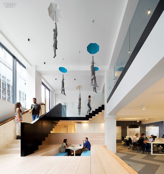
Huge street-front windows reveal a gallery-esque interior where five gray figures are lifted into midair by their upheld umbrellas. They look like a confluence of Mary Poppins, René Magritte, and Juan Muñoz, hovering somewhere between commuters and angels—no floor in sight. That’s because this gravity-defying realm is actually the top of a double-height volume that plunges 8 feet below sidewalk level. 


Commissioned from a Czech artist,
the figures inhabit their environment with confidence. Once you take your gaze off them, however, it becomes clear that the real star is less the figures themselves than the space in which they float. Credit for that goes to Paul Crofts Studio, which gut-renovated the two-level, 7,000-square-foot office for Fold7, an ad agency that counts British Airways and Nike as clients. 


“Fold7’s slogan is Welcome to the Fold,” Paul Crofts starts. “The idea was therefore to create the inviting feel of a hotel lobby.” His introduction of a hotel aesthetic is a smart metaphor, as it manages to avoid typical corporate ennui while establishing the concept of the office as a kind of cocktail of work and relaxation. 


A hotel concierge would be perfectly at home behind Fold7’s recep
tion desk, clad in brass with an amberglow emanating from a horizontal slot at the base. From here, the eye is led to floor-to-ceiling open shelving stacked with books and curios  collected by founder Ryan Newey. The shelves double as the outer walls of a conference room. Around the corner, sections of another shelf-wall pivot outward—a stealth doorway.


The rest of the ground level is
dedicated to communal space. “A very generous gesture from Ryan,” Crofts says. Next to the conference room, the café centers on a marble-topped bar, and high-backed booths at the back define private conversation spots. Fronting everything, facing the gallery and the street, is a lounge of refreshing simplicity. 


“It’s the concept of the office as kind of a cocktail of work and relaxation”


We’ve become used to ad agencies
self-indulgently trumpeting their creative credentials via a plethora of neon lights, street signs, foosball tables, and self-consciously gathered gewgaws either masquerading as found objects or ostensibly “curated” into a composition of stuff. There are a few instances of that here, for example a meeting room where a wall sports the phrase “Smack my pitch up” in, yes, ice-blue neon. 


Nevertheless, the decibels are kept to a conversational level rather than
a scream. The humor truly works in a conference room lined with cuckoo clocks “to remind people that meetings shouldn’t drag on,” Crofts notes.
In the same room, the tabletop is
screen-printed with an angular pattern that echoes the chevrons of the carpet found on most of the lower level. The subtle details throughout include exquisite ceiling fixtures and sconces.


A sculpture in its own right, a
blackened-steel suspended staircase connects both levels by passing through the gallery. Far below the floating figures, its floor is a platform built from Douglas fir boards finished with white lye to achieve what Crofts calls “a modern Scandi look,” in contrast to the upper level’s more residential stained-oak planks. Sunken into the platform are a pair of table-and-seating setups similar to what’s found in a traditional Japanese restaurant. They’re meeting areas, referred to as the Dry Jacuzzis. While the nickname is admittedly jokey, the solution is far more sophisticated than the garden sheds or Airstream trailers one sometimes finds turned into meeting spots.


Thanks to the double height and large windows of the gallery, the lower level’s office area, farther into the building, never feels like the basement it is. Workstations accommodating 45 employees are pushed to the rear without feeling cramped. Walking through, a staff member explains that Fold7’s philosophy is all about ambition. To prove it,
the word ambition is even scrawled in a supergraphic on a wall. But the agency is also all about layering, the idea that there are messages embedded at every level of visual experience. Someone points out a sub-Banksy graffiti-stencil rat on the bottom corner of a door.


Crofts has taken the myriad messages and integrated them into a superbly generous, elegant office space that, perhaps paradoxically, perhaps perfectly appropriately, conveys an image of joyful professionalism. What better expression of a brand could there be? 

Project Team: Into Lighting: Lighting Consultant. Voodoo Designworks: Signage Workshop. Diapo: Stair Contractor. RNY: General Contractor.